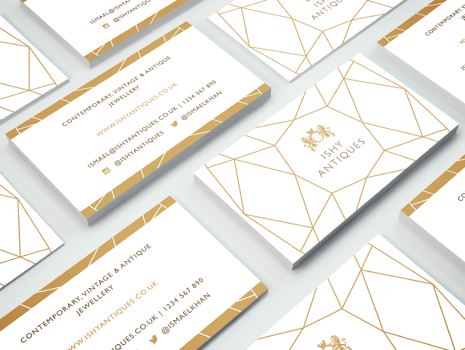
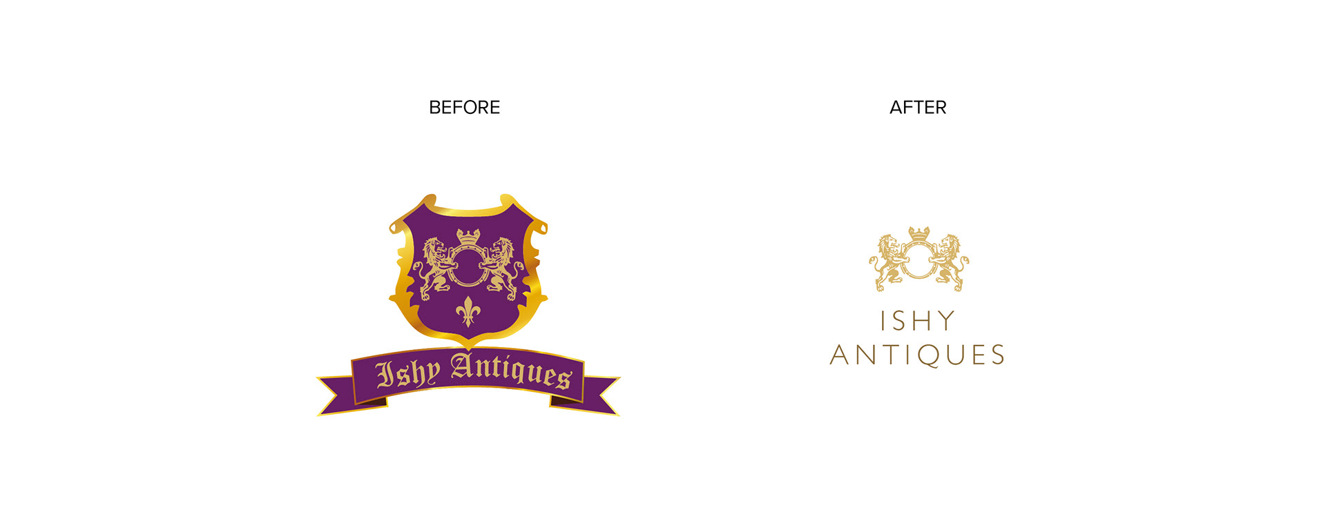
The original brief for this project was to create a contemporary, minimal business card design, however in order to do this I needed to revamp the logo first. The original design was busy, and with its gothic script, rather old fashioned. Instead of reinventing the design entirely, I used the lion and ring design from the old logo, pairing this with a clean, modern font. This small change was all that was needed to bring the brand up to date, with a more contemporary feel.
The business cards were designed in a similar, clean and modern way, with a bold geometric diamond design adding personality. These were printed on a lovely textured board, with the pale gold sections and banding picked out in gold foil.